Is Santa Claus predictable?

Two years ago, we revealed something sensational: Santa Claus is a data scientist. The secret of his success does not lay in his hundred years of experience as a gift messenger, his flying reindeer or his faithful elves. It is his analytical skills that enables him to make Christmas to the most beautiful time of the year for children all over the world.

Since then, a lot has happened in the world of data and algorithms and there are also new, amazing findings about Santa Claus.

Is Santa Claus a regular guest at data science conferences around the world?

Who should know better than Santa Claus: if you rest, you rust. That is why further training is of top priority for the white-bearded and red-suited man, especially during his annual preparation for the Christmas season. There have been reports from useR! 2018 that an elderly gentleman has asked in several talks about the transferability of forecasting models to the behavior of small children. At another analytics conference, participants have noticed a similar-looking man who examined the nearby houses for the size of their chimneys during the breaks.

His elves were surprised when Santa Claus was on an unscheduled training trip for a whole week at the end of summer. But they were even more surprised when he returned: months before the arrival of the first wish list, their boss presented them a comprehensive list of gifts they needed to buy for the upcoming Christmas season. Furthermore, he advised them to take a look at the Santa cloud for further inquiries.

Santa Claus is close to despair

Calm and relaxed: that is how his elves usually describe Santa Claus. Since he has confidence in the ability of algorithms, the occasional transfer of forgotten gifts to the Easter bunny has become a thing of the past. However, by the end of May, the elves have seen their Santa Claus for the first time out of control. Some have described him as simply desperate and they didn’t know the reason.

The sled was freshly polished, the coat was patched, and the reindeers were all in good health. But Santa Claus seemed to believe that the upcoming Christmas celebration is in danger. Only after the visit of a serious looking man in a suit and almost 300 signatures of elves later did Santa Claus calm down. The General Data Protection Regulation did not stop at the man, for whom data and Christmas belong together like pine needles to a Christmas tree.

Santa Claus Vision

The dust has settled, and Santa Claus is back on track with his favorite project: a time-to-event analysis. This time it is not about the children and gifts, the focus is on the adults. In other words, Santa Claus has set himself the task of finding out who is spreading outrageous rumours: doubting Santa Claus‘ existence in front of a child, or even worse than that, denying it altogether. He is looking for the circumstances that make people question him. Parents who are not sufficiently appreciated and plagued by Christmas shopping, siblings in the midst of puberty or the thousands of people occasionally wearing a Santa suit at Christmas markets and celebrations all over the world. Santa Claus wants to be there if a child’s dream could burst again.

But for now, Christmas is just around the corner. Like every year, he is well prepared and ready to take off with his two favorite reindeers „Hadoop“ and „Spark“. Until then, however, he enjoys reading articles about the analysis of Christmas songs, working on his Shiny-Christmas app and dreaming of the bright children’s eyes that will await him.

Despite all the joy about reliable forecasts and the elves who admire him, it is the children’s happiness that makes Christmas so special for him every year. His only drop of bitterness: as Santa Claus, he is not allowed to talk to anyone about his digital winter fairy tale. He is convinced that children’s birthdays, Easter celebrations and anniversaries could be even more beautiful, if many more people knew that the key to giving the perfect gift lies in data.

The entire eoda team wishes you a peaceful Advent season, a merry Christmas and a happy new year 2019.

Dear data scientists, how to make your work even more valuable

In our previous article we have showed you how you can make your daily work easier with the right solution. The optimal support of different data science languages, a scalable environment for the best possible performance, the management of analysis projects and relevant users, as well as the monitoring and parameterization of execution: you have found a solution that gives you space and helps you never lose passion for your job.

But there is still something else: the expectation of colleagues, superiors and customers. Wouldn’t it be great if there is also something for it? A solution that helps you to master the balancing act between complex analyses and constantly changing demands of your environments.

A workflow made for you

Make data science, not bureaucracy: your colleagues in the departments have finally realized that there is more to data than they have always suspected. The upside: your popularity is steadily increasing. The downside: your workload increases too. New inquires, requests about the current project status and further inquiry about results or internal coordination in the data science team: your e-mail inbox often has more traffic than a big city at rush hour. It would be nice to have a solution that gives everyone involved an overview. A workflow that creates transparent processes from the use case definition, the development and optimization of statistical models to the presentation of results and productive use of algorithms in order to free you from overhead. In addition, the workflow promotes cross-functional collaboration to answer data-driven questions.

Data – analysis – results: everything united in one tool without media discontinuity.

Visualizations say more than a thousand words

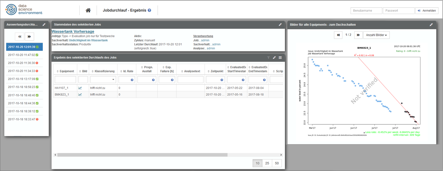
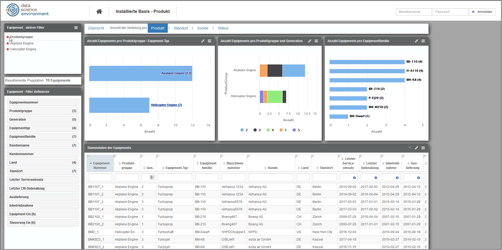
Be productive and show everyone your work, customized and as often as they want: a data science workflow which has been made for this purpose can show your processes clearly and display the status of a request. But there it is, the yearning of people for whom python is only a species of snake and R seems to be just an ordinary letter in the alphabet. The yearning for visualizations – colorful, interactive and self-explanatory. Therefore, you need a tool that can make your analysis results easily available. A solution in which everyone has individual authorizations and can access the results that are necessary for their work. A solution which allows sharing and evaluating results – directly via deep links for accessing views, filters and data easily. Equipped with intuitively usable filter and configuration options so that every user is enabled to draw the maximum information gain from your analyses. You would finally be relieved of generating new reports and your analysis results would get the best possible presentation in the interactive dashboards. Because both, the design and the content, would be freely configurable.

Capture even the most complex results with ease and be able to perform ad-hoc analyses by yourself: this not only attracts attention, but also the enthusiasm of your colleagues, superiors and customers.

Achieve more in your familiar surroundings

Never without my IDE: RStudio, Jupyter, PyCharm or Spyder: The integrated development environment of your choice belongs to you, like data management to the analysis project. So, if there really is a solution that can do all everything described then it should also allow you to work in the familiar development environment via an interface. Furthermore, the interface should also make data access easier for you. After all, you need exactly the data for your analyses that an expert has defined as relevant – quickly and easily.

eoda| data science portal: a solution from data scientist – for your needs

If you have already read the first part, then you can guess it: once again your wishes have been granted.

We at eoda have put our experience from analysis projects and our knowledge regarding everyday challenges and stumbling blocks of your work into one solution: the eoda | data science portal. Evaluate, visualize and link data – the eoda | data science portal brings data science into your company’s daily business. Combine your analytical know-how with your company’s internal knowledge and redefine the limits of reporting. The eoda | data science portal is the collaborative platform that brings you together with people from other departments and helps you to work even more solution-oriented and interactive.

Usability: The DSE allows you to filter, explore and display your data and results.
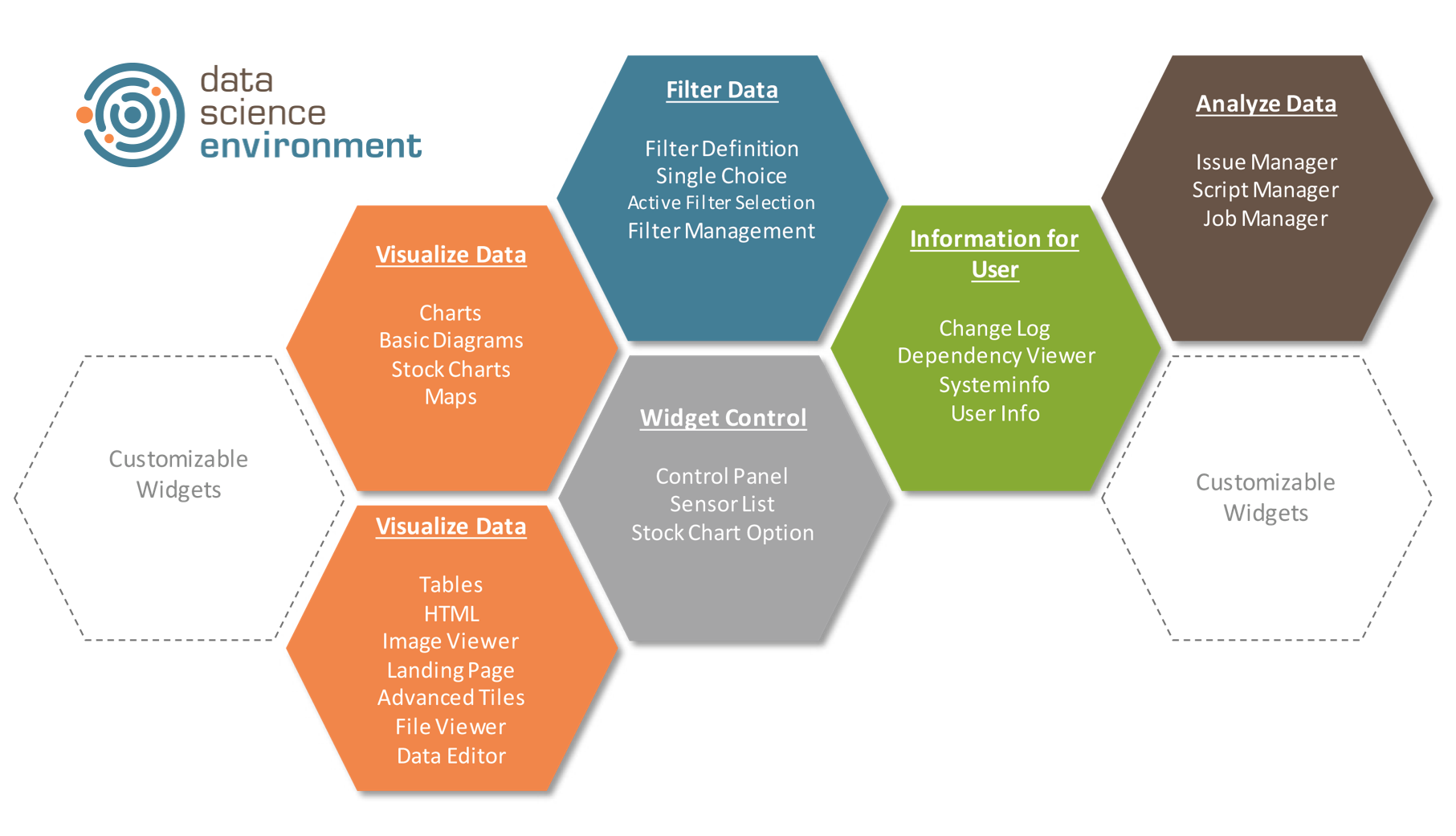
Customizing: You can freely configure the content, functions, size and position of the modules.

Strong processes are based on a flexible solution

As data scientists, all of you have similar tasks and similar requirements to fulfill, but of course, your way of working may differ significantly depending on the specific use case and the processes you have in your company. The eoda | data science portal adapts to this. The modular system with more than 30 flexibly combinable widgets – for example displaying and filtering data – is always the right solution to bring your application closer to the recipient.

The eoda | data science portal combined with the eoda | data science core completes the eoda | data science environment. If you want to learn how you can use the core to manage analysis projects flexibly, efficiently and securely, do not miss our first article.

R and EXASOL: Installing and configuring necessary components

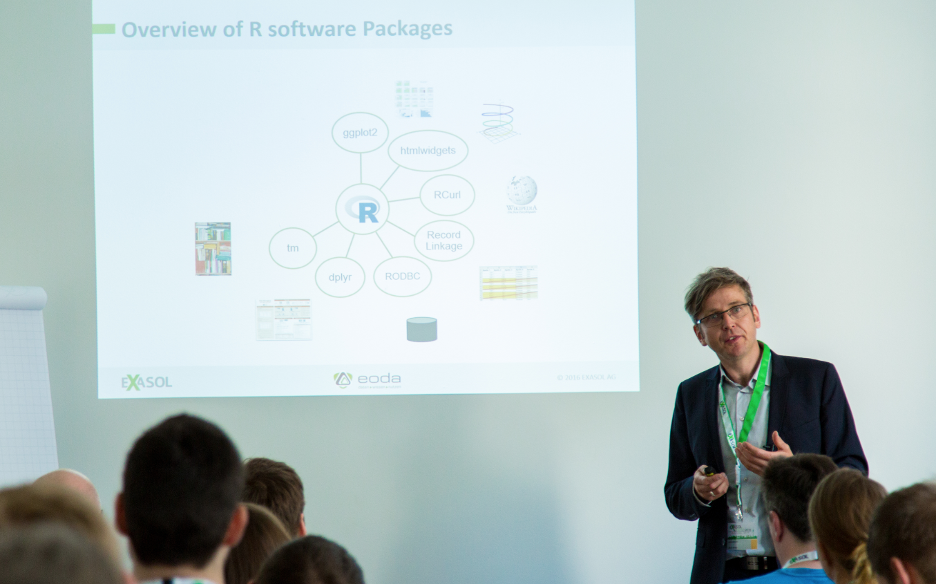
The following text serves as a step-by-step instruction for installing and configuring all the necessary components for the connection of R with the Exasol Community Edition in a Windows environment. The blog entry is based on a webinar from May 13, 2016. If you are already using some of the components, you can simply skip the respective step of the installation.

Continue reading “R and EXASOL: Installing and configuring necessary components”